Thursday, January 29, 2015

Marie-Christine L – France


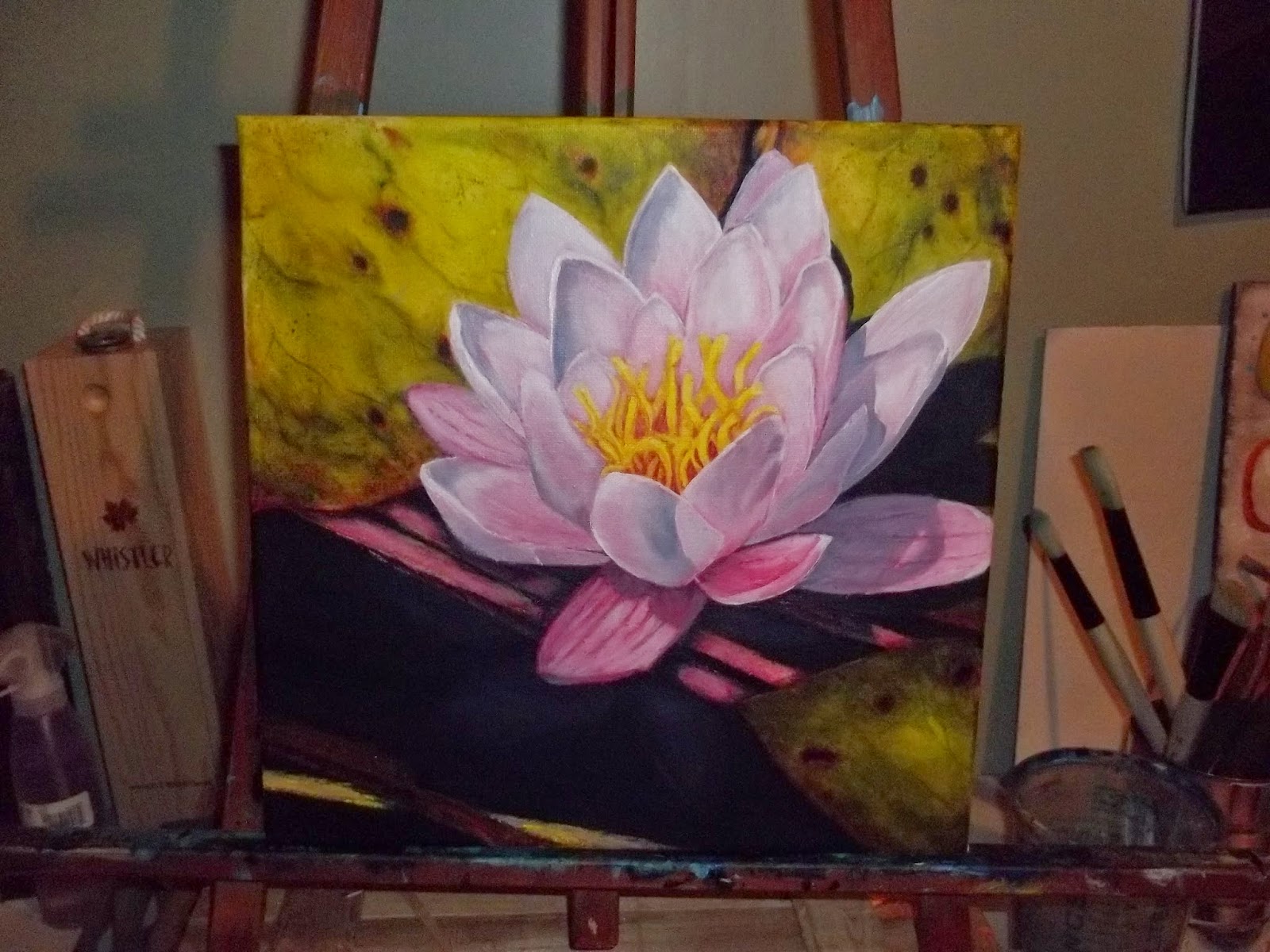
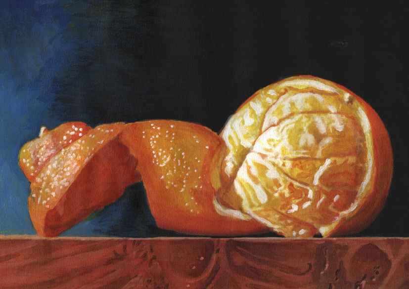
Artist: Marie-Christine L – France
Size: 18 x 25 cm
Medium & Support: Watercolor on hand made paper from Ruscombe paper mill
Artist Blog: http://mclal.blogspot.com
Artist Website: http://aqualal.blogspot.com
Painting Technique:


Funny choice but I decided to use the paper “Azur de Turner”, cotton, flax, hemp, wove hand made by Ruscombe paper mill 240grams.
I first made a pencil drawing not looking at the photo but trying to create harmonious curves and drawing (N°1)
Then I made color samples on the paper’s back as it is the first time I use this paper. (N°2) I finally used a mix of new camboge and opera rose for the orange, new camboge, Payne’s grey, raw umber, burnt sienna, caput mortuum violet on dry paper. (N°3)
I discovered one has to paint “very lightly” on such a paper and not water it at all. I’m rather happy with the result (N°4)

Update (Feb 5, 2015): Pls see link to a new painting (Coffee Break #2) on the same subject by Marie-Christine: http://paintanddrawtogether.blogspot.com/2015/02/marie-christine-l-france-coffee-break-n.html
-------------------------------------


Penny Lee StewArt


Wednesday, January 28, 2015

Valérie M. - "Un café s'il vous plaît!"

  • Title: "Un café s'il vous plaît!"
  • Artist: Valérie M.
  • Size: 26x36cm
  • Medium & Support: Watercolor on Arches paper 300g


  • Title: "A second coffee please !"
  • Artist: Valérie M.
  • Size: 30x40cm
  • Medium, Technique & Support: Watercolor on Montval paper 300g . A second try in a different technique, with more wet in wet effect.

Tuesday, January 27, 2015

Einer Arts - Terri Einer - "Frothy Mug"


I started by printing out a black and white version so I could interpret the image in my own color scheme and not be influenced by the colors in the photo.  Then I sketched a quick composition (image 1). I felt this simplicity of the subject needed some life, so rather than a plain white cup, selected a bold, bright palette.

Using acrylics on canvas, I  blocked in my scene. (image 2) and I followed that up with more detail (3rd image). I paint fast and wet, so I get lots of "happy accidents" when the wet paints touch each other. Once I am pleased with the colors I let it dry and finish with an india ink marker.  I think maybe I liked this one better before I added the black detail lines.  What's everyone else think?

Terri Einer
New website: www.terrieiner.com

Einer Arts
"Frothy Mug", Acrylic on Canvas

Monday, January 26, 2015

Challenge 51 - A Coffee Break


This is our first challenge which starts in this new year 2015 and I want to take this opportunity to wish everyone a Wonderful, Happy New Year and much success at everything you want to do.  In this PADT blog I have had the privilege of interacting with the nicest, kindest people and I am ever so thankful of everyone's support and help. I am also very  grateful to those of us who take the time to share comments and motivate each other.

We all enjoyed the last challenge so much...  reading about the painting processes is so much interesting and educational at the same time. A big thank you to everyone who participated!

It was also fun to see how all  of us artists go through the same doubts and dilemmas and 'tensions' as our paintings progress and that makes the whole process of creativity such an intensely enjoyable endeavor.

About the challenge and composition

In this challenge I invite you to share your paintings on the subject I have posted. This picture is from Cafe Prego in Toronto -  a nice & relaxing place. It is close to my favorite art stores, DeSerres and Curry's; and often I visit this little coffee shop and try out new art supplies which I have just bought.

You are welcome to modify the composition if you like and share with us why and how you did it.

Please send your paintings by March 7, 2015. The next challenge will be posted on March 8, 2015.  

Wishing you happy painting!

Best regards,
Lela


Thursday, January 15, 2015

Marie-Christine L – France - "Waterlily"


“Waterlily – Watercolour on Fabriano paper 140 lbs – 7” x 9”1/2 - (300 g – 18 x 24 cm)
Marie-Christine L – France »

Mercedes Ares (Argentina) - "Irupé"

"Irupé"
Acuarela Canson Montval 24 x 32
Mercedes Ares (Argentina)

Monday, January 12, 2015

Sherry Bevins


Step 1: Light pencil sketch sealed with a wash of acrylic yellow ochre.

Step 2: A shadow study in transparent acrylic burnt umber. When it is dry I seal it with a layer of acrylic glazing medium.

Step 3: First layer of color in transparent acrylics. I can still see my drawing beneath the washes. Once more, I sealed this step when dry with acrylic glazing medium and allowed it dry overnight before moving on to the next step.

Step 4: I rubbed the canvas with a thin layer of water soluble linseed oil, spreading it as thinly as possible and removing any excess with a dry paper towel. I completed the painting in one layer using water miscible oils, making sure to completely cover all traces of my drawing. 

Sherry Bevins
Water Lily
6 x 8 inches
Oil over acrylics on canvas panel

Sunday, January 11, 2015

Cheryl Andrews


Artist: Cheryl Andrews
Size: 12 x 12
Medium & Support: Acrylic on Canvas


Paragraph 1 for Picture 1.  First I do a basic drawing on Canvas, marking some of the darkest shadows.
Paragraph 2 for Picture 2. I then under paint the whole canvas.
Paragraph 3 for Picture 3. I keep adding more color and some details
Paragraph 4 for Picture 4. This is when I start focusing on adding shadows and highlights.
Paragraph 5 for Picture 5. More highlights, shadows and details.

As for the final painting, I am not totally unhappy with it, as I am still new to this, and don't really have a style yet, or know proper techniques. However I do feel I need to work on the reflection, and the lily feels a little muddy to me.

Saturday, January 10, 2015

Larry.t


  • Artiste: Larry.t
  • Taille: 24x32
  • Medium & Support: pa^pier aquarelle
  • Artiste Blog: sans
  • Site de l'artiste: sans
  • Peinture Technique: aquarelle 

Carla Raffaelli


Carla Raffaelli
Watercolor on paper Arches 31 X 41 cm

Palette
Alizarin Crimson
New Gamboge
Indigo

Step 1- Make a drawing and apply masking fluid
Step 2- Paint the leaves new gamboge + indigo and add wet in wet on the boundary alizarin crimson
Step 3 - painting water with indigo + Alizarin, paint the branches with new gamboge, alizarin and indigo
Step 4 - paint the flower with alizarin, indigo + alizarin, new gamboge, paint the blossom center with new gamboge and alizarin, add details

Friday, January 9, 2015

Paula Reynolds

Photo 1:  This is my original drawing, done freehand using a printed copy of the assigned image.  I used a 2H pencil on acrylic paper.
Photo 2:  First I painted the background, not being too careful about going over drawn lines
Photo 3:  Then I added the base color for the leaves.   As I'm slowly transitioning from using craft paint (Ceramcoat) to a more professional paint (Soho), I had difficulty with the difference in paint thickness.  (Here in the Bahamas, everything dries almost instantly, so the Soho was like painting with toothpaste.)
Photo 4:  I always try to paint background to foreground so I don't have to mind the lines so much.  I had to do 3-4 coats of paint, some thick and some more like a wash, before achieving the desired color.  While a few petals were drying, I would do the base coats on others.

Photo 5:  This is the finished project after adding details.  I usually add shadows at the end with a wash so the color can still be seen through the shadow.  I used a wash for the veins, shadows, highlights, and lowlights.  

Overall, I am pleased with the result.  I tend to paint very rigidly, holding tightly to the lines and blending away brush strokes, going for a realistic look.  Funny, considering my favorite art is impressionistic in nature.  I just have trouble letting go......

Artist: Paula Reynolds
Artist's blog:  www.paulareynoldsart.com


Monday, January 5, 2015

Sabine


- I started with painting wet in wet with the pink and roughly giving shape and color to the flower with its yellow stems, leaving part of the flower white.


-Now I added some more color to define the other areas, keeping everything quite light. At this point I also wanted to try the plastic wrap technique, so I pressed the plastic to the green areas while still wet to create some patterns on the leaves.


- Working with the background, i.e. the water. The negative painting is used to determine the shape of the waterlily. I also played with some splashes on the leaves.


- Final shadows to define the shape of the waterlily. I also deepened some other colors, especiall the water, wanting to create more contrast and interest.


- To start I did a few sketches and then a couple of paintings. My way of painting is quite free and emotional. Unfortnately even if the photo is beautiful, I'm not too happy with the painting, as I feel that I wasn't able to 'make it mine' and capture some emotion in the painting!