 Wishing everyone a
 very very Happy New Year! I hope the holidays proved to be refreshing times for you and you had a chance to be with your near and dear ones. I wish and pray that the coming year brings good health, peace and happiness to everyone.
I am so excited to see that everyone has been passionately viewing and commenting on the paintings in the last PADT challenge. Speaking on behalf of all of us, I would like to once again thank you for this overwhelming contribution and response.
Before we move on to the new challenge, let’s reinforce one invaluable lesson we all learned from the last challenge. Please scroll quickly through all submitted paintings for the last challenge (Challenge - 25 - "Betrayed Dreams”). You will notice one very powerful and marvelous attribute all paintings share. By having a story deeply engraved in your mind prior to starting to paint, all submitted paintings communicated very strong emotions and a highly engaging story portrayed through titles, colors, values, lines, edges & additions.
Yes - each painting’s story is unique and different from my story and every other story – but what’s common is the depth of emotions which each painting evokes. This last challenge proves more than any words could possibly do, that – yes you can paint a story and yes it makes an incredible difference. Having a story in your mind prior to starting to paint shapes all your decisions during the painting process and becomes your best friend and guardian angel through the process of painting. A successful painting is almost guaranteed.
--------------------------------------------------
About the composition
This composition is all about lost and found edges, soft edges and carefully controlled light. If you pay a very close attention to all visible and especially those barely perceivable edges throughout the composition, you will notice that there is no single hard, sharp line describing any shape or any form. Everything melts gently from one to another area engaging the viewer’s mind as he gets subtle hints about what is not clearly visible. This is the main motivation for all our efforts in creating the soft and lost and found edges. Of course, it is up to you as an artist to decide where you want to go and in which direction you would like to push your painting towards – how you want to guide your viewers.
A simple rule applies. If you decide to introduce a few hard edges and leave the rest soft and toned down, these hard edges will scream for attention. The effect can be emphasized by using hard edges to divide a very light area from a very dark area, very colorful (high in vibrancy) from very dull passages, strongly emphasized “visible” regions from hidden (and yet noticeable) “invisible” regions. These are some of the best artist’s tools to introduce drama on the stage. However, be cautious when playing with dramatic contrasts. Develop your personal taste for it. Look around and notice how too many works of art today suffer from a “fruit bowl effect”. The abundance of highly vibrant modern pigments is highly tempting and if over utilized, all areas in the painting would scream for attention. Although visually very cheerful, such pieces of art make the viewer confused and he/she does not know where to look. Everything calls for attention. Just remember when was the last time you attended a social gathering where someone from the crowd cut your breath away with too much of otherwise pleasant and expensive perfume irritating everyone around. Even in extremes, remember balance and taste is the crown of the nobleman.
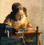
Real masters of “just right balance” achieved a breathtaking theatric effects by masterfully utilizing the very same simple principles described above, producing some of the most visually arresting and psychologically evocative paintings in the history of art. To name just a few - Leonardo da Vinci’s famous “sfumato”, Rembrandt’s play of light “chiaroscuro”, Vermeer’s soft blending and masterful compositions.
To summarize what is important to learn from painting this challenge:
- Keep almost all your edges soft with various degrees of softness.
- Persuade the viewer to search for continuation of the line, shape or edge partially showing it and then partially hiding it in the darkness or behind some other object. Let the objects emerge from the foggy, misty and undefined background – and yet this background is full of air and space.
- Avoid “fruit bowl effect” – having everything screaming for attention with an equal vibrancy. Slightly colored “grays” and “browns” are still very valuable balance in your painting. They allow your vibrant lights to thoroughly sing.
- Complement the composition with any modification/ addition you might feel will improve it, as your creative urges suggest.
I would like to encourage everyone to give it a try and wish you a lot of new development opportunities down the road. Just try it!
For watercolor and acrylic artists - do not let your edges dry hard. This is a moderately challenging composition, not because there are too many complex objects or textures, but because creating very soft, lost and found edges is somehow against human nature. We always prefer “black or white”, “lie or truth”, “yes or no”. There are too many more strongly defined opposites to list them all. Any shades of gray, slightly undefined vague statements, half-truth or half-planned vacation trip full of unpleasant surprises make us dizzy and irritated.
Please send a photo of your painting the latest by Feb 12. The next painting reference will be posted on Feb 13, 2012.


 Pat Koscienski
 Artist- Millie Nguyen


 Artist: Capucine (France)


 Artist: Mico Soleil
 Artist: Horst Hittenberger
 Artist: Debbie Later
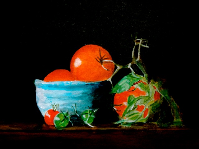
 Title - "Blue Bowl With Tomatoes Finished"


 Artist: Karla Uphoff


