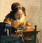
Butterflies are such adorable, delightful creatures - They bring out the best in us. Perhaps this is one of the reasons for such an enthusiastic participation from everyone for the last challenge. And every painting is so lovely! Many of my friends mentioned that they often returned back to PADT in the last couple of weeks admiring the gallery of wonderful paintings.
I want to thank all of us who participated as well as those who provided feedbacks.
About the composition
This composition is all about an old fashioned porcelain jar I found hidden among a pile of pottery in an antique store. What attracted me to it were the amazing complementary colors, blue - orange and the extremely pleasing variety of shapes.
The jar could have been used for anything. In this composition I decided to make it look like it was used to store coffee beans.
As with the majority of our compositions, the light source is positioned at the top left side. This gives great reflections and shadows all accross the jar. The coffee beans introduce a variety of textures complementing the glossy porcelain surface.
There are 2 important tasks to accomplish while painting this composition:
1) Background. In the reference photo there is no background, just plain blue-gray zone. I would like you to try to paint a simple background that will communicate aerial perspective with an undefind space behind the jar.
2) Form, light, texture. As always, please pay special attention to the porcelain surface, textures (esp of the coffee beans), highlights, shadows and reflections. Just for a moment observe how many colors you can find reflected in the metal parts of the jar - then paint them.
Please send a photo of your painting latest by February 19. The next painting reference will be posted on Sunday February 20.


5 comments:
When I saw this composition, I thought the background doesn't look right.
After reading the post with the picture, I know now that the background is purposely left as it is so artists can use their own imagination.
I will be looking forward to paintings on this one!
Could you help me, I am not sure what you mean by an aerial perspective with an undefined space behind the jar. Do yo me it is supposed to look as if we are looking down on the subject?
Hi Debbie, In the simplest manner "aerial perspective" is the feeling of air and space around the elements of the chosen composition. Obviously in the case of a landscape it is much more pronounced and there are many more tools to choose from. It the case of a still life, it is enough to communicate the feeling of atmosphere and space around the chosen subject(s).
If you look at the reference photo, both the foreground and the background are simple, flat, almost 2-dimensional blue gray surface. There is nothing interesting and exciting around the main subject. There is no sense of "atmosphere" and "space" around and behind the subject. Ask your "creative self" what you would like the viewer to imagine while looking at your painting and try to communicate it in a visual form. It might be an aged, cracked wall full of old fashioned character and charm. It might be a small glimpse of light penetrating the dark scene and disappearing in the distance.
Please look at this artist's work for some ideas and let me know if it helps to visualize what I was having in mind. http://antonovart.com/Oil_paintings_archive/index.htm
If you still have questions, please ask.
Lela, thank you so much for your reference to Antonov's wonderful paintings. I must say it's made me think again about how I will compose my painting!
Thank you very much. Now I understand and I am ready to get started !
Post a Comment