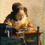
Caroline your painting has a great potential to be really outstanding. I feel you are just a hair away from it.
I would reconsider only 3 areas. One is the shape and the blue color of the jar top. It looks like bended towards left-bottom. The blue in the light area needs to be much more vibrant to "read" as light. Second is a background. The color is almost there, but the value and vibrancy is not. It needs to be toned down (grayed) and darkened , especially in the top left half. The last is the horizon line . It needs to soft blend into the background with softly blended shades so that it does not disturb the viewer.
I am so excited about the potential I see in it that I am almost tempted to ask if I can have a pleasure of seeing the revised version, if you decide to go for it. Thank you!
Hi! We are a group of artists who are passionate about art and also love to help each other through critiques and helpful comments.
"Paint and Draw Together" really gives us a chance to learn from each other and advance in painting and drawing. I look forward to joining together with you in this creative journey through the art world.
 2nd Version


7 comments:
very nice Caroline ,love the background.
Like your warm colors.
Great color choices and application.
Like the softness and glow..especially in the metal mechanism of the lid, love the way its rendered..very satisfying
Caroline your painting has a great potential to be really outstanding. I feel you are just a hair away from it.
I would reconsider only 3 areas. One is the shape and the blue color of the jar top. It looks like bended towards left-bottom. The blue in the light area needs to be much more vibrant to "read" as light. Second is a background. The color is almost there, but the value and vibrancy is not. It needs to be toned down (grayed) and darkened , especially in the top left half. The last is the horizon line . It needs to soft blend into the background with softly blended shades so that it does not disturb the viewer.
I am so excited about the potential I see in it that I am almost tempted to ask if I can have a pleasure of seeing the revised version, if you decide to go for it. Thank you!
Thank-you everyone for your comments and suggestions.. I really want to grow as an artist and I really value all the help and support that I can get..
Thank- you
Caroline
I like the second version you did, probably more than the 1st. Your color & tone add a sense of drama & your jar shape is spot on! Well done!
Post a Comment