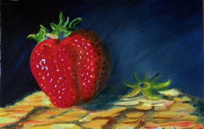
By looking at the painting overall feeling is very pleasant. Strawberry definitely attracts the most of attention and inevitably appetite. Color harmony is fully achieved and balanced. I am pleased with the relation of darks and lights, warm and cool.
With a texture like this the level of details can be overwhelming. However no matter how small or big objects are they still have highlights, lights, shadows and cast shadows as long as there is a strong light source. I am not able to see those light-dark attributes in both strawberry details (seeds) and wood bark as well. Another “wish” for my soul would be to see some misty hazy space behind and around the strawberry to evoke other emotions besides appetite.
Byannick, Nice painting. The strawberry is definetly the center of interest. I like the scaled indications of the wood. The thing I see that may need a little tweeking is the shadow of the strawberry and the background kinda gets lost. Maybe darken the shadow of the strawberry to make it a little more distinct from the background.Thanks for allowing me to view and make suggestions on this beautiful piece of art.
Lela, I agree with the lack of details. But I'm not a "detail" man at all. I have to struggle to get some in! So we will see next time ;) For the haze, I Know I can add it, (perhaps I will try it) but the strong light push me to chiaroscuro. So the lesson is not let the ref lead you were you do not want ;).
Angela, you are welcome. I like suggestions because they are the only way to see with another eye - sometimes two eyes are better... ;) I agree with the lack of variations between shwadow and background. It also one of my problem. I need to mix paints and values better.
You have the most luscious strawberry painted here, I love it. I would agree with the other comments regarding the shadow & background, but I think this is a very good painting.
Hi! We are a group of artists who are passionate about art and also love to help each other through critiques and helpful comments.
"Paint and Draw Together" really gives us a chance to learn from each other and advance in painting and drawing. I look forward to joining together with you in this creative journey through the art world.


7 comments:
Title , "The best is gone"
Sad story uh?, Not for the eater ;)
On the painting itself, I'm quite happy with the berry. The green part lack of contrast Light/Shadow. Do I change the green or only the bark under...
Suggestions Folks?
Very well done, the berry looks ripe and juicy, I would darken the bark on the right side,
Horst
By looking at the painting overall feeling is very pleasant. Strawberry definitely attracts the most of attention and inevitably appetite. Color harmony is fully achieved and balanced. I am pleased with the relation of darks and lights, warm and cool.
With a texture like this the level of details can be overwhelming. However no matter how small or big objects are they still have highlights, lights, shadows and cast shadows as long as there is a strong light source. I am not able to see those light-dark attributes in both strawberry details (seeds) and wood bark as well. Another “wish” for my soul would be to see some misty hazy space behind and around the strawberry to evoke other emotions besides appetite.
Byannick, Nice painting. The strawberry is definetly the center of interest. I like the scaled indications of the wood. The thing I see that may need a little tweeking is the shadow of the strawberry and the background kinda gets lost. Maybe darken the shadow of the strawberry to make it a little more distinct from the background.Thanks for allowing me to view and make suggestions on this beautiful piece of art.
Thanks for comments.
Lela, I agree with the lack of details. But I'm not a "detail" man at all. I have to struggle to get some in! So we will see next time ;)
For the haze, I Know I can add it, (perhaps I will try it) but the strong light push me to chiaroscuro. So the lesson is not let the ref lead you were you do not want ;).
Angela, you are welcome. I like suggestions because they are the only way to see with another eye - sometimes two eyes are better... ;)
I agree with the lack of variations between shwadow and background. It also one of my problem. I need to mix paints and values better.
Thanks again.
Agree with previous comments, and must add that I think your use of reds in the strawberry is a bit of perfection!
You have the most luscious strawberry painted here, I love it. I would agree with the other comments regarding the shadow & background, but I think this is a very good painting.
Post a Comment