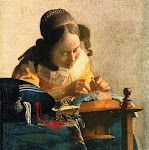
Hi Karla, First of all I want to say that I love the colors you chose. The yellow and red is pleasing to the eye. I like the window in the back. Thanks for allowing us to critque your work. I like the color contrast of the jar it is very good but I think the jar if it were a little larger it would become the prominent center of interest. As it is the window does compete too much. Your table is slightly slanted which may be camera angle. I love the shrubs in the window. Over all this is a very nice painting but the suggestions I gave would give it more strength. I hope this helps. Can't wait to see your entry next month.
1) Composition: As all the others, I like the idea for the background a lot. Morning, kitchen window and open bright day outside. Karla, by looking at your painting, I fill like your intention was to bring in the red flowers and the bright yellow wall as the focus of the painting, the same as Angela commented.
2) Color harmony: If I separate the wall, window and flowers as one entity, all looks harmonious and great. If I look at the coffee jar and black-gray table top, they look great together as well. However all together ... this black table surface somehow is alone and jar is almost not noticeable.
3) Aerial prospective: Karla this is your strongest point in the painting. By choosing the lighter and bluer colors in the distance and darker and deeper colors at the front, in addition to the great composition, the sense of space is very well communicated.
4) 3D Form: There is a great sense for value relation, lines & shadows. All looks round, shaped and something you can grab from the painting and actually hold in your hand.
5) Texture: Some of the texture is lightly recognizable, but not much. This might not be much of a deal, since majority of the impressionist paintings don't have much of the texture anyway.
Thank you for painting this challenge Karla. I hope you would find PADT feedbacks fruitful in the long quest for "artists perfection" each of us is striving for.
Karla - I like your painting very much. Those red lines are captivating! It is so interesting to read the other critiques and I do agree that the background competes (& steals) the attention from the jar. But it isn't just about the jar in this painting, is it?
Hi! We are a group of artists who are passionate about art and also love to help each other through critiques and helpful comments.
"Paint and Draw Together" really gives us a chance to learn from each other and advance in painting and drawing. I look forward to joining together with you in this creative journey through the art world.


5 comments:
good job Karla, nice wall and flowers in the window.
Your addition of the red brightens up the still life. Nice work.
Hi Karla, First of all I want to say that I love the colors you chose. The yellow and red is pleasing to the eye. I like the window in the back. Thanks for allowing us to critque your work. I like the color contrast of the jar it is very good but I think the jar if it were a little larger it would become the prominent center of interest. As it is the window does compete too much. Your table is slightly slanted which may be camera angle. I love the shrubs in the window. Over all this is a very nice painting but the suggestions I gave would give it more strength. I hope this helps. Can't wait to see your entry next month.
1) Composition: As all the others, I like the idea for the background a lot. Morning, kitchen window and open bright day outside. Karla, by looking at your painting, I fill like your intention was to bring in the red flowers and the bright yellow wall as the focus of the painting, the same as Angela commented.
2) Color harmony: If I separate the wall, window and flowers as one entity, all looks harmonious and great. If I look at the coffee jar and black-gray table top, they look great together as well. However all together ... this black table surface somehow is alone and jar is almost not noticeable.
3) Aerial prospective: Karla this is your strongest point in the painting. By choosing the lighter and bluer colors in the distance and darker and deeper colors at the front, in addition to the great composition, the sense of space is very well communicated.
4) 3D Form: There is a great sense for value relation, lines & shadows. All looks round, shaped and something you can grab from the painting and actually hold in your hand.
5) Texture: Some of the texture is lightly recognizable, but not much. This might not be much of a deal, since majority of the impressionist paintings don't have much of the texture anyway.
Thank you for painting this challenge Karla. I hope you would find PADT feedbacks fruitful in the long quest for "artists perfection" each of us is striving for.
Karla - I like your painting very much. Those red lines are captivating! It is so interesting to read the other critiques and I do agree that the background competes (& steals) the attention from the jar. But it isn't just about the jar in this painting, is it?
Post a Comment