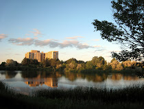
I love, love, love this. Well now enough about that. The only thing I see for possible change is the building is pretty close to the center of the painting and may work better at the top or bottom third of paper but that is just me.
Angela, you're right -- so many things to remember. I have to be very careful, because I tend to get so involved with what I want to put down on the paper, sometimes I don't pay enough attention to where I put it. I did crop it a little on the bottom, thought it was too much foreground, maybe that would have helped. Have to look at the original tonight to see. Thanks for your help.
I have terrible trouble doing watercolor, so I always stop & admire watercolor paintings. They grab my attention because they are a difficulty for me. This is an interesting piece, and the colors evoke a sort of melancholy feeling to me. Love work that evokes an emotion. I agree with Angela on the placing of the building so close to center.
What a great compliment! I think every artist paints to evoke some type of feeling in the person looking at the art and there's so many paintings out there if you can get someone to stop and look at yours for a little longer than the next one, that's what it's all about! Thanks so much. You can bet I'll pay more attention to placement -- and my final cropping of the painting.
Hi Erma, I also like the colour palette you used very much and how you painted the foreground with the little flowers. Your painting is very lively to me. Only thing I thought could look a little bit "better" is the reflection of the building - I mean it's very big, I would like to see more water between reflection and foreground to get further depth. But apart from this - a very nice work.
I enjoy the difference of this painting with it's more melancholy look and the loose watercolor brush strokes. That is hard for me to do in a watercolor, I tend to use it more like acrylics, so I appreciate those than can use them "watery". I think the middle section, between the grass and trees is just too busy. It distracts from the rest of the painting. A little more space between grass and building would have smoothed out the slight center chaos. Just my humble opinion, though!
Hi! We are a group of artists who are passionate about art and also love to help each other through critiques and helpful comments.
"Paint and Draw Together" really gives us a chance to learn from each other and advance in painting and drawing. I look forward to joining together with you in this creative journey through the art world.


7 comments:
I love, love, love this. Well now enough about that. The only thing I see for possible change is the building is pretty close to the center of the painting and may work better at the top or bottom third of paper but that is just me.
Angela, you're right -- so many things to remember. I have to be very careful, because I tend to get so involved with what I want to put down on the paper, sometimes I don't pay enough attention to where I put it. I did crop it a little on the bottom, thought it was too much foreground, maybe that would have helped. Have to look at the original tonight to see. Thanks for your help.
I have terrible trouble doing watercolor, so I always stop & admire watercolor paintings. They grab my attention because they are a difficulty for me. This is an interesting piece, and the colors evoke a sort of melancholy feeling to me. Love work that evokes an emotion. I agree with Angela on the placing of the building so close to center.
What a great compliment! I think every artist paints to evoke some type of feeling in the person looking at the art and there's so many paintings out there if you can get someone to stop and look at yours for a little longer than the next one, that's what it's all about! Thanks so much. You can bet I'll pay more attention to placement -- and my final cropping of the painting.
Beautiful brush strokes
I miss the highlight on the building (but is just me)
A little discrepency between trees and tree reflections (too much near the building)
A fine watercolor with evening feeling in it
Hi Erma,
I also like the colour palette you used very much and how you painted the foreground with the little flowers. Your painting is very lively to me. Only thing I thought could look a little bit "better" is the reflection of the building - I mean it's very big, I would like to see more water between reflection and foreground to get further depth. But apart from this - a very nice work.
I enjoy the difference of this painting with it's more melancholy look and the loose watercolor brush strokes. That is hard for me to do in a watercolor, I tend to use it more like acrylics, so I appreciate those than can use them "watery". I think the middle section, between the grass and trees is just too busy. It distracts from the rest of the painting. A little more space between grass and building would have smoothed out the slight center chaos. Just my humble opinion, though!
Post a Comment