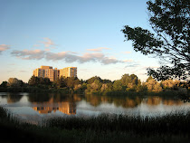
Nice colors, tree shapes and contrast very well executed, the only question I have is the lake-front horizon line, maybe Lela can elaborate on this, I feel it could be straighter. Horst
Hi Paula, Glad you posted such a lovely painting for us to view. Your buildings are very good. I like the colors and you were able to create a believable building. I like the way your clouds are painted.
The areas I see for improvement are The one top cloud seems to be in the center of the building and is a little distracting. I also think if you use more yellows and reds in your green it will give you deeper colors even when going for light shades instead of white which kinda washes things out and makes them somewhat chalky.
Thanks for sharing with us your beautiful artwork and being kind enought to allow us to point out areas of improvement. Keep on Painting.
Such a creative 'rendering' of the composition. Paula, you made the lake look so much more charming in your painting. I think there is a little hint of mystery also since the trees in your painting look bigger as if we are on the edge of a deep, mysterious forest.
Thanks for the advice. I agree with you Horst, the lake edge is off, too distinct. I was trying to clean thing up a bit but ended up making the edge too strict and distracting. I do need more yellows and reds. I have the painting still set up in my studio, aka my kitchen, and will try to work on it. It's great to get advice from some awesome artists! Thanks!
On the first image I had not adjusted the saturation of the photography to match the true vibrancy of the colors. The first was not as chalky as the image. All I did on the second version was repaint the trees, grass, add highlights to the reflections and water, and paint over the annoying central cloud. I was going for a washed out dusk effect with the first but it just came out blah. Thanks for all of your suggestions and responses!
Nice colours here. Correction though, Its "eh" Not "Aye" . Canvas board is a tough one for me, I tryed it for the first time, After I work with it a bit it might serve better. You have is down pat. I'll stick to watercolours. Nice work.
I love the changes you made on this. All of the changes you made have really brought this painting from blah to great! Isn't it amazing how 1 simple little cloud piece could be so annoying in the overall look? Nice work.
Hi! We are a group of artists who are passionate about art and also love to help each other through critiques and helpful comments.
"Paint and Draw Together" really gives us a chance to learn from each other and advance in painting and drawing. I look forward to joining together with you in this creative journey through the art world.


11 comments:
Nice colors, tree shapes and contrast very well executed, the only question I have is the lake-front horizon line, maybe Lela can elaborate on this, I feel it could be straighter.
Horst
Hi Paula, Glad you posted such a lovely painting for us to view. Your buildings are very good. I like the colors and you were able to create a believable building. I like the way your clouds are painted.
The areas I see for improvement are The one top cloud seems to be in the center of the building and is a little distracting. I also think if you use more yellows and reds in your green it will give you deeper colors even when going for light shades instead of white which kinda washes things out and makes them somewhat chalky.
Thanks for sharing with us your beautiful artwork and being kind enought to allow us to point out areas of improvement. Keep on Painting.
Such a creative 'rendering' of the composition. Paula, you made the lake look so much more charming in your painting. I think there is a little hint of mystery also since the trees in your painting look bigger as if we are on the edge of a deep, mysterious forest.
Thanks for the advice. I agree with you Horst, the lake edge is off, too distinct. I was trying to clean thing up a bit but ended up making the edge too strict and distracting. I do need more yellows and reds. I have the painting still set up in my studio, aka my kitchen, and will try to work on it. It's great to get advice from some awesome artists! Thanks!
Paula, Much better. You really achieved an improvement. You really captured more depth and the deeper tones are wonderful. Hooray!
I like your 2nd version, too!
The second version is such an improvement, you did wonders with those trees,
Horst
On the first image I had not adjusted the saturation of the photography to match the true vibrancy of the colors. The first was not as chalky as the image. All I did on the second version was repaint the trees, grass, add highlights to the reflections and water, and paint over the annoying central cloud. I was going for a washed out dusk effect with the first but it just came out blah. Thanks for all of your suggestions and responses!
Nice colours here. Correction though, Its "eh" Not "Aye" . Canvas board is a tough one for me, I tryed it for the first time, After I work with it a bit it might serve better. You have is down pat. I'll stick to watercolours.
Nice work.
I love the changes you made on this. All of the changes you made have really brought this painting from blah to great! Isn't it amazing how 1 simple little cloud piece could be so annoying in the overall look? Nice work.
Nice improvements.
The little cloud bothered me too ;)
It can be the photo but in the 2nd version, the green is quite the same on all the trees.
Well done
Post a Comment