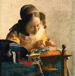
Well, gang, here's my latest submission in watercolor -- the only medium I paint in thus far. The background in the painting as posted is a little lighter than the original, but still looks pretty good in contrast. I think the nectarine on the left is a little hard and overworked and my water drops absolutely did not work! I'd like to hear your critiques so that I can learn from my mistakes.
Hey gang, what do you think? Quite a challenge for watercolor, but that's all I know. I think the nectarine on the left is hard and overworked, and my water droplets didn't work at all, but like most of it. Appreciate your critques. Erma
Thanks Byannick. Good idea about the size of the water droplet and the ellipse of the glass. I have huge problems with perspective which I continue to work on. I was pleased with the glass marbles, too - lots of fun painting them.
Watercolor is one of the most challenging mediums to handle and “make it behave”. While majority of landscape paintings and “free form” compositions are relatively easy to paint in watercolor, subjects requiring precision become challenge. You have done a great job in making every possible effort to handle challenging composition and you should be proud of the results.
What I see thoroughly artistic in your painting is the fact that you very successfully turned “hot-warm-burning” composition into “calm-refreshing-cold colored” one.
Since the composition required very precise shapes and positions, if you do not feel comfortable with free hand drawing print the photo and trace it lightly before attempting to paint. This way prospective, shapes and positions will be just right and not displaced.
Edges, light, texture – all this is increasingly difficult to handle in watercolor and paper you are using makes such a huge difference. If you e.g. use Arches paper or similar high-end brand, it will give you more time to blend and achieve soft color transition before it dries (which is usually the case with student quality papers). If you would like any specific “how-to” question to be answered, please ask.
Hi Erma, I say hats off to you for just attempting such a composition in watercolor. There is so much about this painting that I like. I love the colors you chose and the fruit just grabs my eye and makes me look closer. I think the blue shadow of the fruit on the left works well. On the right the shadow of the fruit and the glass is a little distracting and takes away a little from the main focus. The blue is somewhat strong. The shadow across the wall on the right just seems to stop at the top of the glass. The marbles are nice and also I like your glass. As stated by Byannick work on your elipses. Over all though cudos to you because this is a beautiful work.
The subject of this photo didn't particularly appeal to me until I saw your painting--there's a lot of drama in how you've painted this still life. I too like your colors--the background wash glows, and the peaches are luscious. The glass is beautifully handled and I like the curve on the wall. I think the cast shadows may be too dark and too blue? Though cast shadows are dark, you should make them whatever's best for your painting. I might, if it were my painting, soften the edge of the peach shadow on the wall; the edge is softer in the part of the shadow that falls on the table and shadow edges become less distinct the farther they are from the object. It's a lovely painting though--very strong and interesting to look at!
Hi! We are a group of artists who are passionate about art and also love to help each other through critiques and helpful comments.
"Paint and Draw Together" really gives us a chance to learn from each other and advance in painting and drawing. I look forward to joining together with you in this creative journey through the art world.


7 comments:
Well, gang, here's my latest submission in watercolor -- the only medium I paint in thus far. The background in the painting as posted is a little lighter than the original, but still looks pretty good in contrast. I think the nectarine on the left is a little hard and overworked and my water drops absolutely did not work! I'd like to hear your critiques so that I can learn from my mistakes.
Hey gang, what do you think? Quite a challenge for watercolor, but that's all I know. I think the nectarine on the left is hard and overworked, and my water droplets didn't work at all, but like most of it. Appreciate your critques. Erma
Nice watercolor.
Good job, nice crisp fruits and beautiful glass pearls
Water drop - next time think lighter values and a little bigger ;)
Perspective problem - the shadow of the glass is too symetrical
upper ellipse of the glass is not round enough
Thanks Byannick. Good idea about the size of the water droplet and the ellipse of the glass. I have huge problems with perspective which I continue to work on. I was pleased with the glass marbles, too - lots of fun painting them.
Watercolor is one of the most challenging mediums to handle and “make it behave”. While majority of landscape paintings and “free form” compositions are relatively easy to paint in watercolor, subjects requiring precision become challenge. You have done a great job in making every possible effort to handle challenging composition and you should be proud of the results.
What I see thoroughly artistic in your painting is the fact that you very successfully turned “hot-warm-burning” composition into “calm-refreshing-cold colored” one.
Since the composition required very precise shapes and positions, if you do not feel comfortable with free hand drawing print the photo and trace it lightly before attempting to paint. This way prospective, shapes and positions will be just right and not displaced.
Edges, light, texture – all this is increasingly difficult to handle in watercolor and paper you are using makes such a huge difference. If you e.g. use Arches paper or similar high-end brand, it will give you more time to blend and achieve soft color transition before it dries (which is usually the case with student quality papers). If you would like any specific “how-to” question to be answered, please ask.
Hi Erma, I say hats off to you for just attempting such a composition in watercolor. There is so much about this painting that I like. I love the colors you chose and the fruit just grabs my eye and makes me look closer. I think the blue shadow of the fruit on the left works well. On the right the shadow of the fruit and the glass is a little distracting and takes away a little from the main focus. The blue is somewhat strong. The shadow across the wall on the right just seems to stop at the top of the glass. The marbles are nice and also I like your glass. As stated by Byannick work on your elipses. Over all though cudos to you because this is a beautiful work.
The subject of this photo didn't particularly appeal to me until I saw your painting--there's a lot of drama in how you've painted this still life. I too like your colors--the background wash glows, and the peaches are luscious. The glass is beautifully handled and I like the curve on the wall.
I think the cast shadows may be too dark and too blue? Though cast shadows are dark, you should make them whatever's best for your painting. I might, if it were my painting, soften the edge of the peach shadow on the wall; the edge is softer in the part of the shadow that falls on the table and shadow edges become less distinct the farther they are from the object.
It's a lovely painting though--very strong and interesting to look at!
Post a Comment