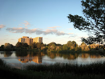
On a positive side you captured the composition and all important element very successfully. Knowing that you painted this in one day, I am impressed. I also like the format of the painting you have chosen. It looks better in that “wider” view and I am convinced different effects can be obtained simply by playing with where the horizon line is placed and where the focus is.
Now what can be improved? This is hard part because at this point I am working with assumptions. Horst, I am absolutely positive that your camera does not do justice to your work. Even if you try hard, oil paint is not going to give you plenty of muted soft tones up to this extent. Maybe you can try to adjust contrast and vibrancy on your computer so that it looks like real painting. If you do not have anything else (don’t rely on MS Office products at all), good free graphical software available on the net is GIMP. Just search in Google “download GIMP” and get it. Another advice I can give is shoot your pictures in a bright sunny day but on the shaded balcony or similar conditions so that direct sun light is avoided. It takes time to practice, but it works. Bottom line I would like to see real colors and vibrancy, as much as it is possible to be able to comment on them. Getting real colors is always a pain but we can at least try our best.
Another point I would like to bring to your attention is reflection of the building. It simply does not match the “above ground” building. Shape does, but windows do not. Reflection is always distorted upside-down picture of what is above ground relative to the ground level and chosen vanishing points.
You can try to correct this “windows reflection”, get better picture and send it so that all of us can enjoy it. I know you appreciate honest feedback and I am very grateful for that.
I agree with Lela on the shape of the buildings and windows reflected in the water, don't match with those on the ground. I do like the warm muted tones used in the landscape, reminds me of a summer sunset. I really like the foreground detail (branch and grasses) which emphasize how far it really is across the lake. I use MS Picture It as my digital imaging program and think it works pretty good.
I love this painting. We get such a soothing and relaxing feeling. You really made a wise choice to paint it 'widescreen' - it gives a sense of wide panaromic landscape.
Horst, How did you beat me at posting? Such a slacker I am. First all I love how you captured distance. Your buildings are nice and you have been able to maintain sharp clean edges. The clouds are soft and just drift across the sky. Good Job.
Now areas I see that can be improved on are as others have said your reflection. Enough on that. I think if your sky were lighter at the horizion line it would add a little depth. Also maybe a little deeper value blue at upper sky and lower water might help.
Your grass in the foreground is nice. Thanks for allowing us to view your artwork and leave you honest feedback. I expect the same. Happy Painting.
Whether intentional or not, I like the repeating use of triangles in the painting. The clouds form an inverted triangle that fit in the triangular pitch of the roof line. The foreground grass; triangle, tree branches; triangle, building reflection; triangle. I also really appreciate the artistry of this piece. I can't really describe what I mean. The feeling that a really great artist did this and probably did it quickly with amazing results.
As stated by the others, the windows on the building's reflection is the only thing that is slightly off about this otherwise gorgeous painting. They are too cartoon-y compared to the rest of the piece.
But I love it. Thanks for the advice for me, too. I love, need, and appreciate advice from great artists!
Horst, What a big difference. So much brighter and with more depth. I like the blues you added. Your reflection is much improved. The grass in the foreground is very nice. You really stood up to the challenge on this one.
I like both equally, really. The first is subtle, gentle, and calms the spirit. Like walking the banks of the lake alone or sitting reading a great book. The second is vibrant, bold, and excites the spirit. Like walking the banks with a lover or playing fetch with a dog. The reflections in the second is more complete than in the first painting, but I feel both ways sometimes so I can feel both paintings, too.
I am like Paula, I like them both! Each one conveys different feelings to me. But I do love the bolder colors in the second one, especially those touches of violet in the clouds & reflections. The detail you added to the foreground grass and the tree on the right really add depth to the overall image.
Hi! We are a group of artists who are passionate about art and also love to help each other through critiques and helpful comments.
"Paint and Draw Together" really gives us a chance to learn from each other and advance in painting and drawing. I look forward to joining together with you in this creative journey through the art world.


11 comments:
On a positive side you captured the composition and all important element very successfully. Knowing that you painted this in one day, I am impressed. I also like the format of the painting you have chosen. It looks better in that “wider” view and I am convinced different effects can be obtained simply by playing with where the horizon line is placed and where the focus is.
Now what can be improved? This is hard part because at this point I am working with assumptions. Horst, I am absolutely positive that your camera does not do justice to your work. Even if you try hard, oil paint is not going to give you plenty of muted soft tones up to this extent. Maybe you can try to adjust contrast and vibrancy on your computer so that it looks like real painting. If you do not have anything else (don’t rely on MS Office products at all), good free graphical software available on the net is GIMP. Just search in Google “download GIMP” and get it. Another advice I can give is shoot your pictures in a bright sunny day but on the shaded balcony or similar conditions so that direct sun light is avoided. It takes time to practice, but it works. Bottom line I would like to see real colors and vibrancy, as much as it is possible to be able to comment on them. Getting real colors is always a pain but we can at least try our best.
Another point I would like to bring to your attention is reflection of the building. It simply does not match the “above ground” building. Shape does, but windows do not. Reflection is always distorted upside-down picture of what is above ground relative to the ground level and chosen vanishing points.
You can try to correct this “windows reflection”, get better picture and send it so that all of us can enjoy it. I know you appreciate honest feedback and I am very grateful for that.
I agree with Lela on the shape of the buildings and windows reflected in the water, don't match with those on the ground. I do like the warm muted tones used in the landscape, reminds me of a summer sunset. I really like the foreground detail (branch and grasses) which emphasize how far it really is across the lake. I use MS Picture It as my digital imaging program and think it works pretty good.
I love this painting. We get such a soothing and relaxing feeling. You really made a wise choice to paint it 'widescreen' - it gives a sense of wide panaromic landscape.
I like your colors, Horst, the reflections are very hard to bring up and you did a nice job.
Horst, How did you beat me at posting? Such a slacker I am. First all I love how you captured distance. Your buildings are nice and you have been able to maintain sharp clean edges. The clouds are soft and just drift across the sky. Good Job.
Now areas I see that can be improved on are as others have said your reflection. Enough on that. I think if your sky were lighter at the horizion line it would add a little depth. Also
maybe a little deeper value blue at upper sky and lower water might help.
Your grass in the foreground is nice. Thanks for allowing us to view your artwork and leave you honest feedback. I expect the same. Happy Painting.
Whether intentional or not, I like the repeating use of triangles in the painting. The clouds form an inverted triangle that fit in the triangular pitch of the roof line. The foreground grass; triangle, tree branches; triangle, building reflection; triangle. I also really appreciate the artistry of this piece. I can't really describe what I mean. The feeling that a really great artist did this and probably did it quickly with amazing results.
As stated by the others, the windows on the building's reflection is the only thing that is slightly off about this otherwise gorgeous painting. They are too cartoon-y compared to the rest of the piece.
But I love it. Thanks for the advice for me, too. I love, need, and appreciate advice from great artists!
Horst, What a big difference. So much brighter and with more depth. I like the blues you added. Your reflection is much improved. The grass in the foreground is very nice. You really stood up to the challenge on this one.
wow! You brought the painting to life in the new version!
I like both equally, really. The first is subtle, gentle, and calms the spirit. Like walking the banks of the lake alone or sitting reading a great book. The second is vibrant, bold, and excites the spirit. Like walking the banks with a lover or playing fetch with a dog. The reflections in the second is more complete than in the first painting, but I feel both ways sometimes so I can feel both paintings, too.
I am like Paula, I like them both! Each one conveys different feelings to me. But I do love the bolder colors in the second one, especially those touches of violet in the clouds & reflections. The detail you added to the foreground grass and the tree on the right really add depth to the overall image.
Godd one Horst.
One tool you can use when doing reflections is to flip 90° your canvas as it is easier to see see symetry right-left then up-down.
At least you can check ;)
Post a Comment